Evaluation for format research on music magazines
Within the format research carried out investigating music
magazines and analysing aspects of the features within the magazines
themselves, the norms and typical features of a music magazine is revealed as
these are repeated throughout all different magazines and as a reader you can
find these immediately and instantly know that it is a stereo typical music
magazine feature. This could be to do with layout of the pages, positioning of
text and images, positioning of headlines branding and lots more. The more magazines you begin to analyse the more
you can notice these features and realise how often they are used.
Front covers of the
magazines:
After looking at three different music magazines and
analysing the features on each, you can begin to see the stereo typical layout
and features of a normal magazine and understand how they work within the genre
of music, target audience and other aspects.
Through the
research which took place, the reader can quite clearly see that with magazines
of a younger target audience, the use of images on the front page is used more
often and the variety of colours used within the magazine front cover is
greater than those of which are for older target audiences. Each magazines
colour choice is suited to the target audience in some way and it relates to
the rest of the magazine with the house colour being carried out through the
rest of the magazine and linking the whole of the magazine together. With
Kerrang magazine, the uses of dark colours for most of the text and images
relates to the genre of the music being conveyed in the magazine and this is
carried through the rest of the magazine also as you can see in the double page
spread. Although the contents page which I analysed had brighter colours on the
front page, this does not defy convention as the use of often brighter colours
within the magazine is effective has it helps certain parts of the text to
stand out more, and having brighter colour on the contents page gives this
emphasis to certain sections of the text and the headlines of the featured
articles in the magazine.
Although I analysed
a classical magazine front cover, I was unable to find contents and double page
spreads for this specific magazine, however this did not affect my research as I
investigated into different genres of music and layouts of magazines, so this
choice of front page was good for my research as it gave me a variety of
different genres to analyse and understand the features used. The classical music
magazine in which I chose had a very plain choice of colours and there was a
lack of different colours used. This reflected in the target audience as it was
for an older age group, so less variety of colours was necessary as colours
aren’t always the attraction for older target audiences.
With the last
magazine being Q magazine and having the same aged target audience as Kerrang
magazine, the use of colours seemed to be brighter once again, and brighter
than those on the classical music magazine. As already mentioned this is due to
what attracts certain target readers and this is what makes the magazine more
effective and easily sellable for the target audience purposed for. Although on
this magazine there is a use of darker colours, this helps the branding/masthead
to stand out more and this is effective for the selling of the magazine as
target readers will know which magazine they are reading by the immediate use
of bright colours. This defies convention slightly as instead of using bright
colours for the whole of the magazine and attracting the target audience, they have
purposely used brighter colours for the branding of the magazine which helps it
to stand out more and become more recognisable.
Within my own magazine,
I would like to combine both of these ideas within my own design as they are
both very effective. My magazine will consist of bright colours for the younger
target audience that I am aiming my magazine towards and with the use of
colours, I am going to be very careful as although I don’t want to make the
colours on my magazine very dull, I also do not want to include a large amount
of colours in the magazine as I want my brand to stand out as much as possible and
become recognisable for readers so that they are immediately familiar with the
brand and what the brand includes. This will help to defy convention slightly
as I mix the two ideas together and will help my magazine to become more unique
and original rather than following the norms of a typical magazine for the
whole of my design.
Another norm of
the magazines revealed within the front cover was the use and placing of
mastheads. Within all three magazines that I analysed, you can see that the
placing of the masthead is always at the top of the page mainly bannering
across the width of the page. Although Q magazine slightly defies convention,
with the placing being to the top left hand corner of the page, rather than
bannering across the top of the page, or being central, it is still part of the
norms of a typical layout of a music magazine as the masthead is at the top of
the page. With some of the most common magazines which are often bought by
regular readers, they masthead is slightly covered by the image as the design
of the magazine is made because the brand is so recognisable that you don’t need
to have all of it showing. I feel that this idea of part of the masthead being
covered would have to be a longer process within the making of the magazine as
firstly you would need a large audience that buy the magazine and that would
easily recognise the branding. This would then be the time to use this feature
of the magazine as you already have a large audience willing to buy the magazine
and so the view of the masthead is not as important as they already know which
magazine they are buying and they know what is included in the magazine.
For the creation
of my own music magazine I am going to follow the norms of a typical magazine
and place my masthead at the top of the page in the centre so that it is easily
recognisable for the readers. I will have my masthead I n bold writing emphasising
the name of the magazine. My masthead is going to be the brand of the magazine.
I want to make my masthead the brand of the magazine as this will help
advertise the masthead more and readers will become easily familiarised by the
brand and they will start to easily recognise it in the different issues. This
will keep the masthead the same on every single issue keeping consistency throughout
the magazine and giving professionalism and formality.
Throughout all
three magazines, there is a consistency with the use of images, and although all
three magazines are different the consistency is through the norms of the
typical music magazine. On the typical magazine featured and covering most of
the page is a large image of a famous artist. This famous artist is usually the
main headline and main article in the whole magazine. On the often magazine, but
not all magazines there are a few other images on the page that advertise other
articles within the magazine which are also featured articles within the
magazine. Around the edges of the page and to the left third and right third of
the page, the text is placed. This is so that it is out of the way of the main
image, and it is in smaller text so that it doesn’t take the lime light way
from the main image. The layout described is featured on all three of the
magazines that I have analysed and shows that it is a norm of the typical
layout of a magazine.
For the creation of
my own magazine I am going to stick to the norms of the layout of the magazine
as this is effective for music magazines and the layout is set out well and in
a way that the audience can easily read the text on the magazine and also view
the images. The layout is clear, easily
read and simple. This will be good for my younger target audience as it will be
simple for them to read and easily set out so that they can work their way
round the magazine easily. This layout is effective for younger target
audiences because although it is a simple layout it still looks professional and
formal.
To conclude, in my
own magazine I am going to stick to most of the norms of a typical magazine as I
have found that these are very effective on the magazines that I have analysed
and I aim to make my magazine as successful as possible. Although sticking to
the norms of a magazine is good, I would also defy convention with some aspects
as I want to add originality to my own magazine and make it my own. Defying
convention will add originality and make it different to general music magazines.
Contents pages:
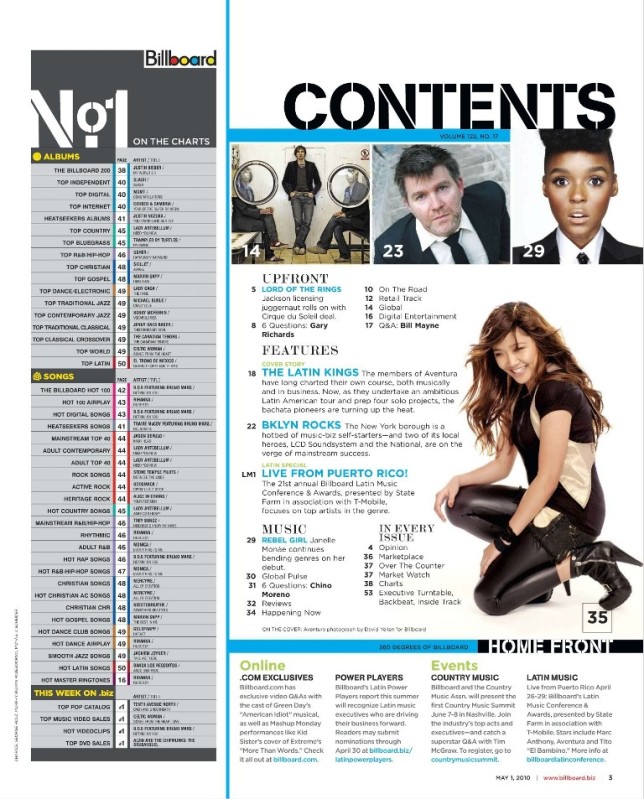
After analysing Kerrang, Billboard and Q magazine contents
pages and with some analysing of the front cover pages as well, links can be
made from these two pages and things within the magazine are carried throughout.
Although not analysing Billboard magazine front page, you can still make links
from assumptions of what could have been included on the front page from the
view of the contents pages. From the analysis of the three different magazines there
are aspects in which you can take and see are typical aspects of a music
magazine or any magazine as these features and aspects are carried through in
all magazines.
Features which are
the norms of a typical magazine contents page and featured in most magazine
contents pages include use of image, branding and amount of text (headlines and
captions underneath headlines).
To start with
the use of image was bold, and through research you can see that there is use
of at least one large image and then on some magazines there is a use of other
images as well, but a main image on the contents page is a norm and found on
most magazines. Although through research you can see that Billboard magazine didn’t
exactly have one main image and there were a few images placed at the top of
the page, you can still tell that there is an element of one of the images
which is meant to be a main image. The magazine does try and stick to the norms
of a typical magazine with this aspect, although it isn’t as clear as the other
magazines as these images are placed in different areas of the page and with
more text around. The use of different placing of the images goes against the
norms of a magazine and defies convention in this magazine as the images are at
the top of the page. Although this is effective for this magazine and its
target audience, in my magazine I would not defy convention with the use of
placing of images and the main image being subtle as this would not work with
my target audience as my target audience will include teenagers and to draw
their attention into my magazine I will need to use the aspects and stick to
the norms of a contents page for this audience. I will take the ideas from Q magazine
and Kerrnag magazine to attract my target audience and these two magazines have
the same target audience helping to give me ideas for my magazine. The large
images placed close to central of the page show the norms of a magazine and
this is what I aim to use in my magazine to stick to the norms and attract the
readers that I intend to get.
The next feature
which is carried out on all three magazines in which I research upon, is the
branding and this is shown as a norm of music magazines also as I found that
this was on all three magazines researched and featured on most magazines that
you will find. The use of branding is mostly vivid on the Q magazine as this is
clearly carried through onto the contents page and also onto the double page
spreads. The branding is clearer on this magazine as the branding is bold and
clearly shown on the front page of the magazine. Although the other two
magazines also showed their branding carried through onto the inside of their
magazine, it isn’t as clear as Q because they have made sure in their magazine
that it is large and standing out for the reader reassuring them of the magazine
that they are reading and constantly reminding the reader which magazine is in
their hands. With Billboard magazine they have carried the brand throughout the
magazine; however isn’t very eye catching and it tucked away into the corner of
the page. With Kerrang magazine contents page they have carried it through and
they have placed it within the contents headline. It is as bold as the branding
of Q, magazine although it doesn’t stand out as much. Within my magazine that I will be creating, I
am once again going to stick to the norms of a magazine with the use of
branding as I feel that within the magazines, especially Q magazine, it was
very effective and eye catching for the reader. Within my magazine I would like
to make my brand very recognisable so that when readers see the brand they will
immediately know that it belongs to my magazine and I am going to carry it
through my magazine just like Q magazine has done as this is effective and
helps readers get used to the brand even more, and making them recognise it.
Looking at the use of text and headlines, I found
that target audiences of teenagers and of a younger age group, there is less
text underneath headlines and on the contents page there is lack of lots of
text. This is effective for the target
audience (as mentioned in my analysis) because younger audiences are more
likely to pick up magazines with lack of text as they enjoy the use of
pictures. I am therefore going to stick with this idea for my target audience
as I will want to attract as many readers for my magazine as I can and draw in
my audience easily.
Double page spreads:
From analysing the double page spreads of three different
magazines, likewise with the contents pages and front cover pages you can
identify the norms of the typical double page spread. All three magazines which
I analysed for the double page spreads had the same sort of layout and were
very similar with each other. This shows a norm of a typical layout of a
magazine.
By analysing the
double page spreads of all three magazines I found quite a few norms of the
typical magazine. These include position of main image, article title positioning,
article positioning and size and drop caps. Firstly the position of the main
images seemed to be the same throughout 2 of the magazines; however one of the
magazines defied convention and went against this. But sticking to the norms of
magazines, on Kerrang magazine and Q magazine, the positioning of the pictures
on the double page spread seemed to be on one of the pages (either left or
right) and the image seemed to fill the whole of the page. The image filling the whole of the page makes
it stand out easily for the reader and for younger target audiences this is
effective as it draws the reader in quickly with the large interesting image
and lack of text on the page. It seems
to be that the large image that fills the page is usually on the left hand
page, but some are featured on the right hand page.
The article title
positioning is placed on the opposite page to the main image at the top of the
page. On the Q magazine there are two article title headlines, one which
features the brand and carries it through the magazine and one which is the
actual article title. The use of a branding title and an article title is
effective as it helps to carry the brand throughout the rest of the magazine.
The positioning of the article title at the top of the opposite page is
effective as it is right as the top; therefore standing out immediately because
readers usually scan from the top of the page to the bottom. Depending on where
the images are depends on where the article title will be placed, but if the magazine
sticks to the normal layout then the article title will be in the original
place already described.
Depending on the target
audience and the amount of text that can be written about an article, depends
on the size of the article and therefore the placing of the article on the
double page spread. For the younger target audiences the text seems to be
limited and in small sections. It is placed on the opposite page to the main
image and underneath the article title. With the older age groups there seems
to be more text on the page and in more columns. This is effective for this
specific audience as they will enjoy reading more about the artists or problem
in the media.
The last norm of a
typical magazine is the use of drop caps within the text. Although not all
magazines include these in their articles, the majority of them do and so this
makes it a norm of the magazine. The drop cap helps to emphasise the first word
of the text, and it also gets the reader involved in the text straight away
with the bolder letter being more eye catching.
In my magazine I would
like to stick with some norms of the typical magazine to keep it formal and professional.
For my images I want to stick to the norm with one of them being on one of the
pages and I would quite like a few other images on the other page, but not as
large and tucked more away as the article will also feature on the other page
to the image. This will give my double page spread a variety of images by sticking
to the norm but slightly defying convention as I add my own idea into it. I am
going to stick with my article title being at the top of the page, and my
article itself being on the opposite page to the main image, and slightly to
the left, leaving space for images or any other text I choose to place on the
page. I will also have a drop cap at the beginning of my article to help emphasise
the first line of the article and help to stand out more for the reader.
Although there
are any norms within these three magazines that I analysed, there are also a
lot of aspects which defy convention and go against the norms with these. In my
magazine I would also like to use features which will defy convention as this
will help my magazine to be unique and slightly different to the other
magazines. In the magazines that I have analysed I found that two of them
defied convention and went against the norms. They were only small aspects to
do with the placing of images, but this made their magazines unique and
different to the others.
Firstly there was
the image difference with the Vibe magazine. The placing of images on this magazine
is different to the other magazines as the images are placed along the top of
the page and then the text and the article title is placed underneath this. This
is effective for its target audience as it is for older people and so they enjoy
reading more about the article. The placing of the images at the top is effective
and a change of ‘scenery’ for the double page spread.
The other magazine
which slightly defied convention was Kerrang magazine double page spread as
this features more than just one image on the page. It features one page with a
large image on and then there are smaller images on the opposite page. Although
this defies convention it is effective as it gives a variety of images for the
article.
For my magazine I would
like to take the second idea and include this in my magazine as I would like a
variety of different images on my double page spread. I aim for this to attract
more readers as I feel the more images there are on the page then the more
viewers I may achieve with a young target audience. However I do not want my
double page spread to be too packed and busy as this may push readers away as
they do not know what to look at and could get confused with the article.
To conclude I am
going to use aspects within my magazine which go with the norms and those which
also defy convention. This will mix up the ideas within my magazine, giving it
originality but also sticking to stereo typical features of the magazine also
as this helps to stay professional and formal.